Goblin The Shopkeeper - Switching workflow to Arnold

Work In Progress / 01 June 2018

For the past few months I was thinking about switching my renderer from Octane to Arnold. So when I started designing new character for my game I decided to render it in Arnold and learn it’s workflow. So here is my work in progress on the character.

First color test in Substance Painter

First Arnold render test

Character

The shopkeeper is character that will be mainly visible in the UI of the game. He is more like a decoration. I want to render him in few different poses making weird and funky faces. One example where he will be located is somewhere on top of the Store UI with greedy face holding a coin.


Early version of head material, you can still spot that displacement is too strong and few other problems.

My game has High Fantasy setting and character should fit into that world. Also because of his role I wanted players to see him as a sneaky, greedy and annoying little bastard. So Goblin was an obvious choice for me.

Arnold vs Octane

I had few reasons why I wanted to switch to Arnold. It is production ready and tested software. It has support for many plugins that I’m interested in. It’s also more intuitive when it comes to material creation. Especially when I want to work with materials like Skin, Milk or Jelly.

Some random render

Octane is still my hidden pleasure because of the GPU support (Soo much faster when I want quick and rough render). Another advantage is Color Response option on the camera, that gives me ability to apply color grading to render inside 3ds max. Last but not least, standard camera effects are a bit more intuitive (Maybe because it’s so fast to render and iterate on it)

In the end both are really good and have their own advantages.

Hope you enjoy!

Report

UX in Lineage 2: Revolution Part 2

General / 06 March 2018

This is continuation of the article that you can find here.

Monetization

Popups/Offers

L2:Revolution developers also use annoying method of communicating to players what offers are available in the shop. They use fullscreen popups when player enters game. Everytime that player gets disconnected, popup will come back. Game also might show multiple of those offers in short period of time or we could get the same offer twice in a span of 10 seconds after entering game. 


Entering in-game shop also might result in popup shown to us.

On top of that, amount of information inside offers can be enormous.

There is also tick that says “Don’t show for Today” but it’s only available for some fullscreen popups and it resets the day after.

Those mechanics are a great way to annoy players, I’m sure we can do better than that.

“Generosity”

Lineage is very generous to players, awarding them each day with multiple rewards from all kinds of quests and missions. Loot drop rate is also high, we even have an option in settings to ignore items below specific grade. This kind of generosity is part of what makes the game so addictive in short term. It’s a good approach to reward players often at the beginning but rewarding them generously in the long run has negative side effect. Players can get used to amount of rewards very quickly and the excitement level goes down. 

There is a fine balance between having too many rewards and not enough. Rewards are way to motivate players and excite them. If we use that too often, rewards don’t feel valuable anymore. If we use them too little we lose players motivation to move toward specific goal.


It all comes down to how much developer thinks about his audience. Understanding players is important part of the development.


”Auto Loot Minimum Grade” settings where we have ability to ignore items with certain quality 

Technical

Server

When moving around UI in L2: Revolution we can experience delays when opening menus. What is probably happening here is that game validates player action on the server side. Usually it doesn’t bother players because when implemented efficiently, players won’t notice it. In case of L2:Revolution validation is visible in normal use. Interacting with UI that has delay always decreased the experience for user because user interface doesn’t respond fast enough for players to comfortably interact with it.

Usually UI needs to respond on average in 0.1 second to user for him to feel that reaction was instantaneous. Above that value user starts to feel discomfort. One second is the limit for user's flow of thought, everything that has higher delay dramatically reduces user experience. 

Summary

As a summary I need to say that Lineage 2:Revolution is a quality game. UI is consistent, art is beautiful and players can get quickly hooked up. It invokes nostalgia because of similarities to original Lineage 2 game. It has great mechanic to auto hunt that makes the game much more approachable and lighter for general audience.


Game monetize players really well. But aggressive monetization and addictive game loop leave players exhausted. Developers force on players multitude of fullscreen popups and amount of daily tasks reinforced by generous rewards creates really exhausting core loop. Those elements hurt significantly UX.


While we don’t know exact retention statistics I would speculate that those are also affected by it.

Usually top country in terms of revenue is US. But Lineage performs much better on Asian markets especially in Japan and Korea. There might be few reasons for it. First is that Lineage 2 in Korea was widely popular. Also in Asia, players tend to have much longer play sessions than in the West. 

Overall Lineage 2: Revolution has mediocre user experience and developers should not take it as an example but it has few unique ideas that might be interesting to check.

Report

UX in Lineage 2: Revolution

General / 06 March 2018

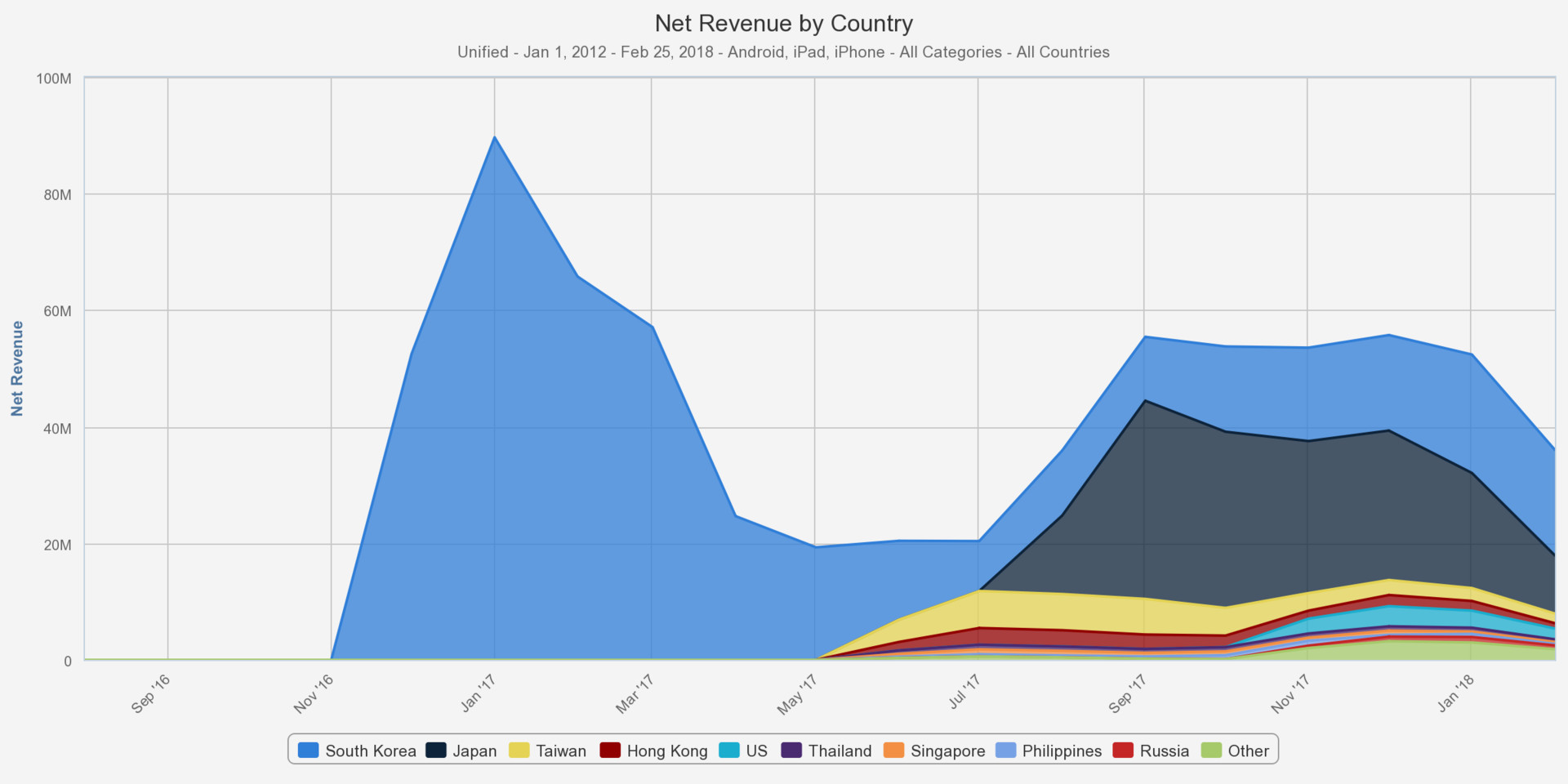
This time I’m going to take a close look at Lineage 2: Revolution. It’s a modern approach to MMORPG genre for mobile phones. It’s a younger brother to Lineage 2 from NCSOFT, released in 2003. Current incarnation was developed by Netmarble and grossed already more than 600 mln dollars since launch.

L2:Revolution is example of an IP that originated on “big platforms” and was successfully transferred onto mobile market. 

With this article I want to answer a question, is UX in L2:Revolution worth learning from?


Let’s start our analysis from user interface. It’s something where MMORPG genre always struggle because of how complex those games are.

User Interface

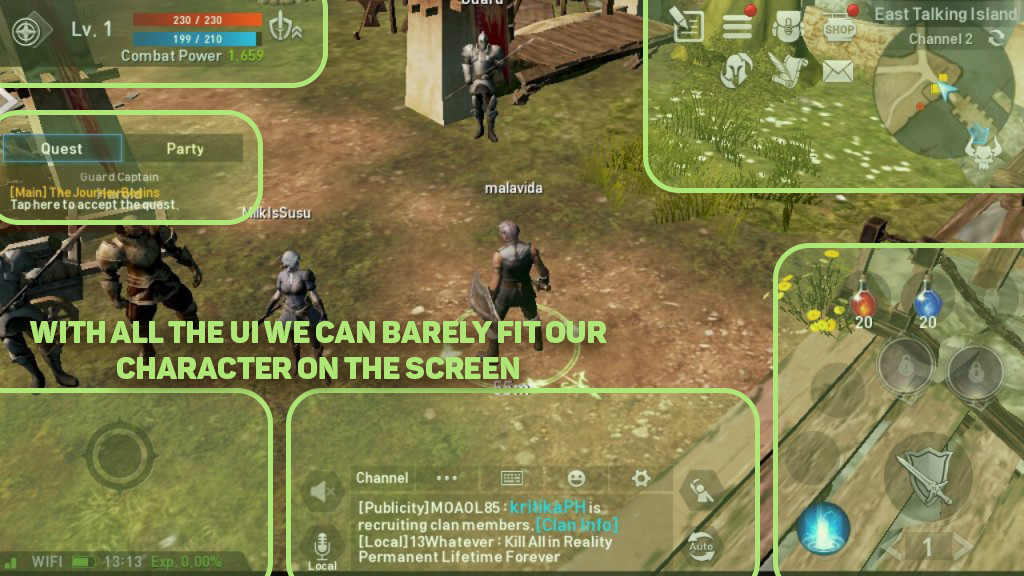
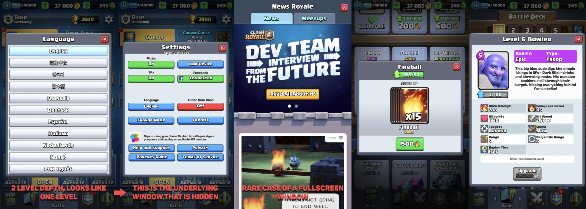
First few minutes with Lineage interface are overwhelming. User is hit with massive in-game UI. Fortunately there are good parts. I need to add that in the tutorial interface is limited and developers tries to not make it to overwhelming.

UI Pillars

Consistent UI it’s a foundation for great UX and Lineage tries to keep that foundation on a high level. UI elements like buttons, texts, icons, backgrounds have their own distinctive look, so we never mistake them for something else.

Separation between background and interactive elements is clear and key functionality is always appropriately highlighted.

Developer used common symbols for icons so understanding them is intuitive for many players. The style of icons also helps with clarity. Font is clear and readable at all sizes.
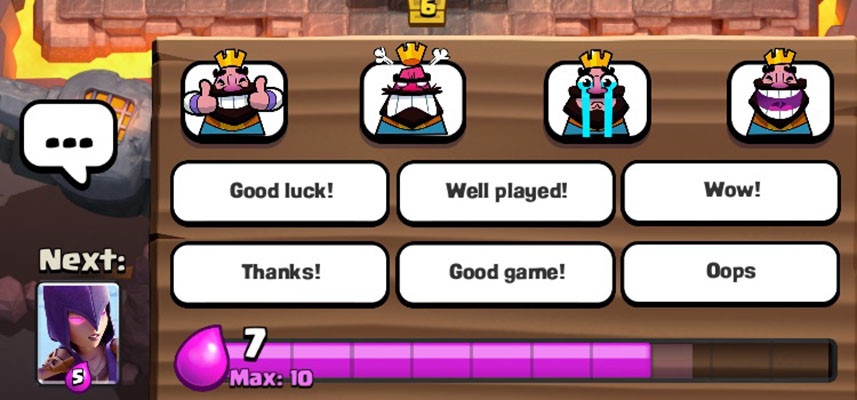
Notifications

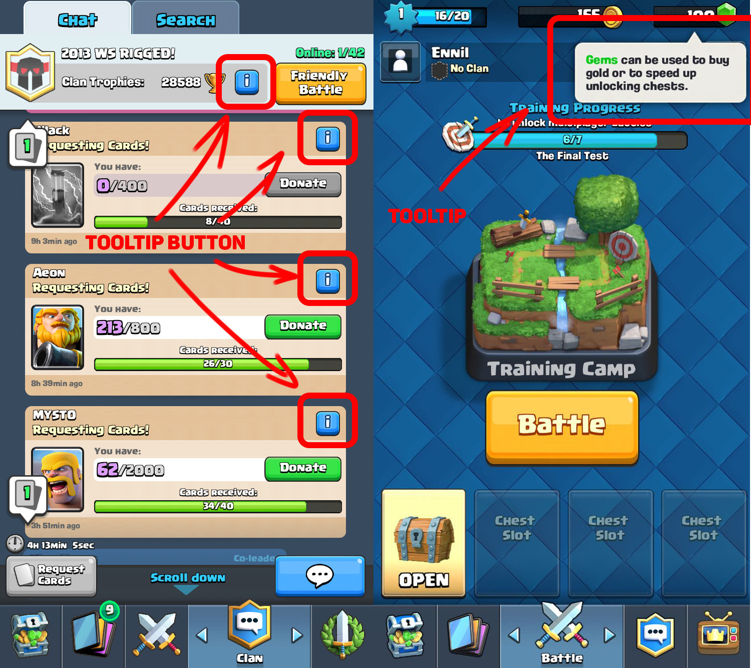
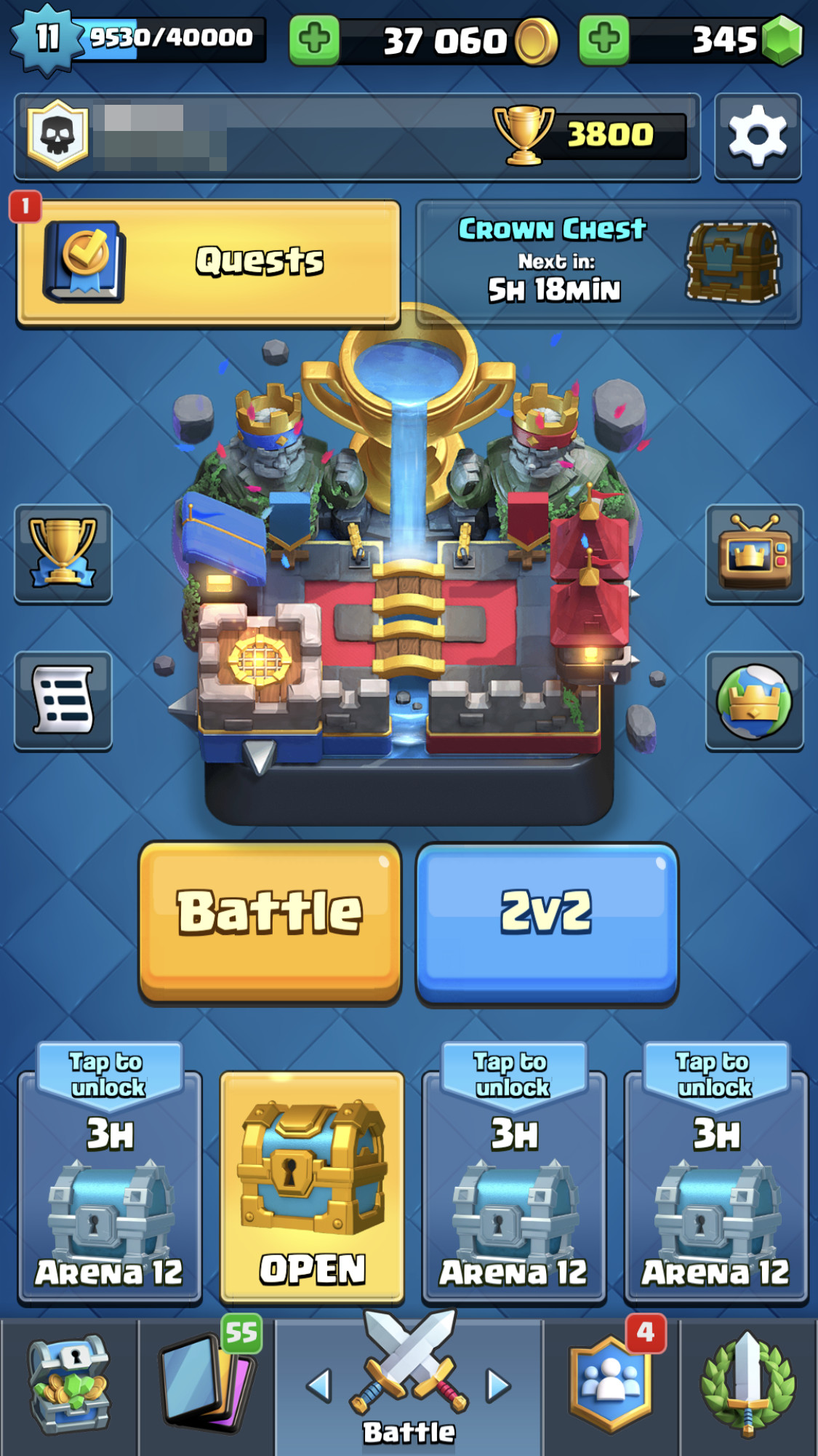
My personal favorite is visual notification system. L2: Revolution notifies players that there is something of interest in the UI by showing just a red dot, simple and clear. Color and contrast separates notification from the background elements and makes it pop. Its great combination of simplicity and clarity. Their use of red color is also important because of the usual meaning in cultures that makes us focus on it.

Delight

When basic user needs are meet, designer is able to move to higher levels in the hierarchy of needs. On the top of the hierarchy we have the feeling of pleasure. Most memorable UI’s is one that brings the feeling of delight to the user that interacts with it. It can be achieved with audio, animation. VFX, art or combination of those. L2:Revolution has few places like that.


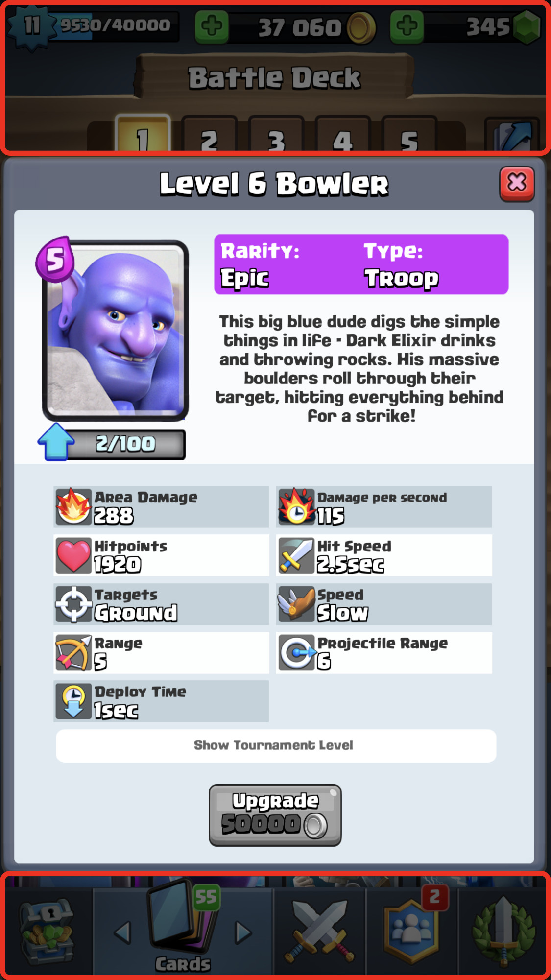
UI screens with rewards, upgrading, leveling equipment and enchanting has beautiful particles and animations that feel really good. By creating strong foundations and polishing key UI screens, L2:Revolution created satisfying and memorable progression experience.  

Level Up

Free shop item


Cognitive Load

MMORPG games rarely have clear or minimal user interface. It’s no different for L2:Revolution.

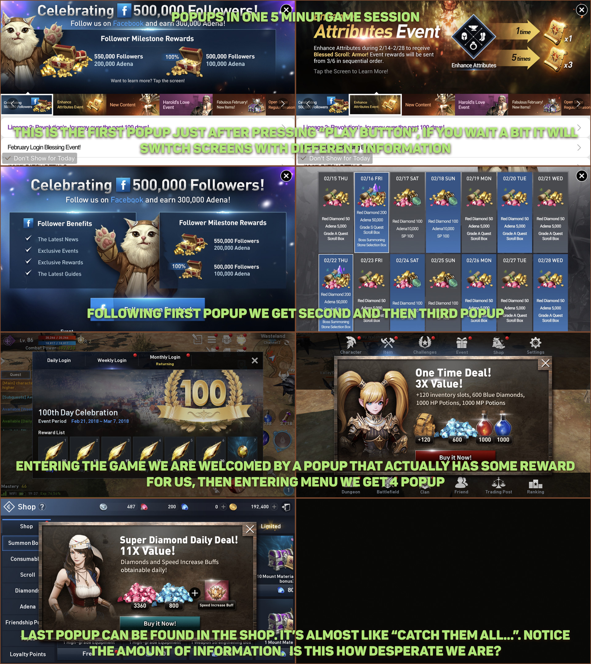
Interface is overwhelming and it continues to be problematic for some time while playing. It’s also quite slow to navigate through UI’s just purely because of the number of menus. Player often feel confused because of the amount of information available on the screen.


Gameplay UI is no different, it’s hard to follow changes in the UI. Amount of information is overwhelming and great notification system or consistent UI does help but not solve that problem.

Creating habit

Part of the problem with information overload in L2:Revolution is brain capacity to remember. As a developer we want players to create habits and come back often to our game. Creating complex UI with difficult flow we significantly slow down this process.


As a side effect users need to use a significant amount of processing power to navigate through UI. It is less noticeable on console and PC platforms but mobile games are different type of beast. Complex UI is problematic because of the nature of the platform. Users need to be aware of their surrounding and sooner or later players tend to get tired of heavy user interface.

One of the unique and biggest benefits to mobile platforms is that they are mobile. Developers shouldn’t forget about that.

Positioning

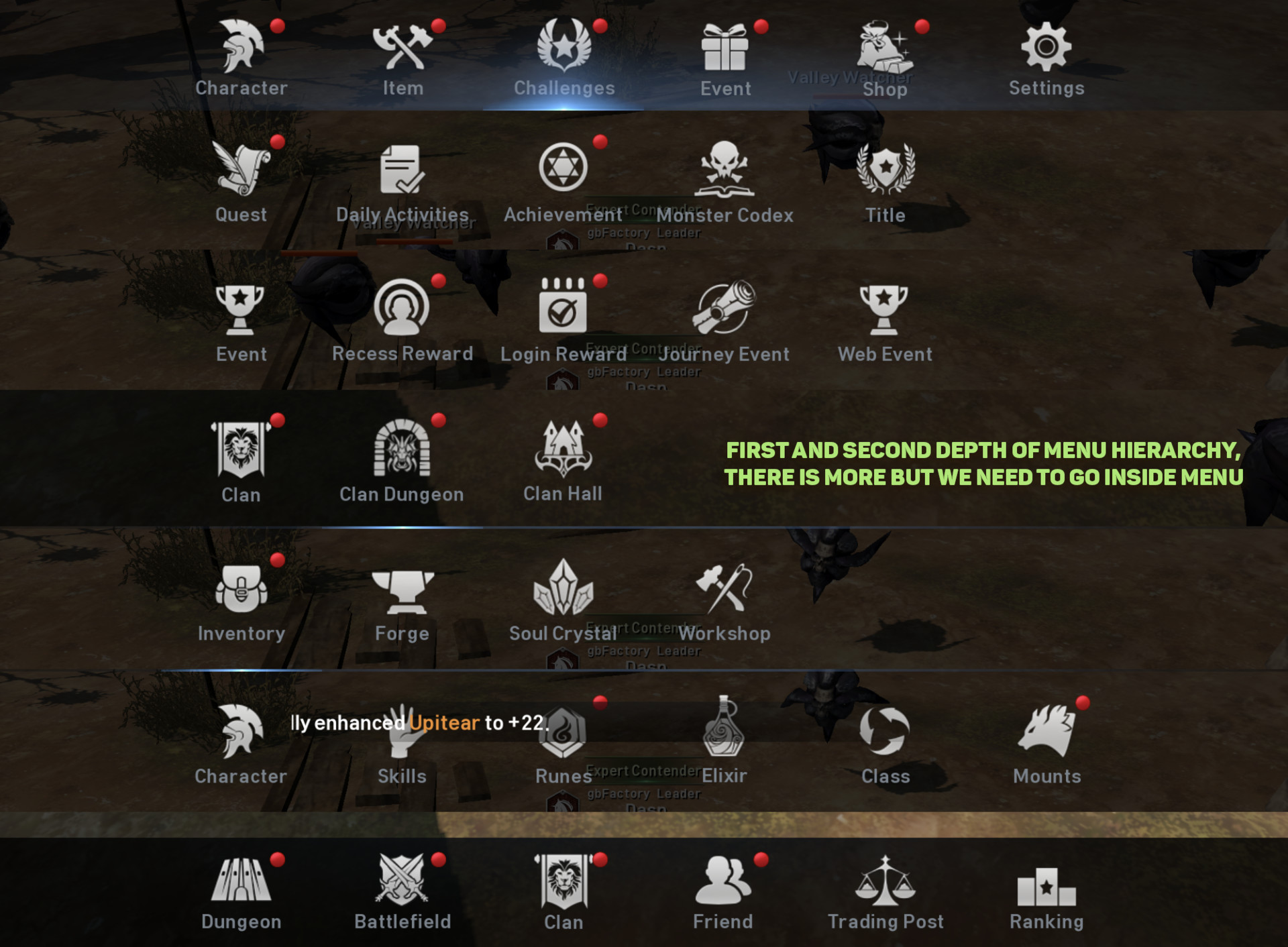
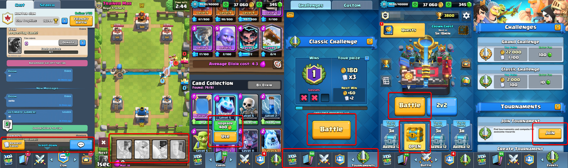
Lineage has two types of exit buttons on the top part of the screen. Those two buttons try to minimize the problem with navigation. We have “back” button functionality and “exit” button. Position of those buttons forces players to extend their finger to the top of the screen. Usually it might not be a big problem but L2:Revolution has more than 30 submenus. That makes UI navigation cumbersome in the long run. 


Overall positioning of UI elements is not bad but there are parts that could be done better. Having complex interface requires at minimum great navigation system that allows swift movement between screens.

Gameplay

Auto Play

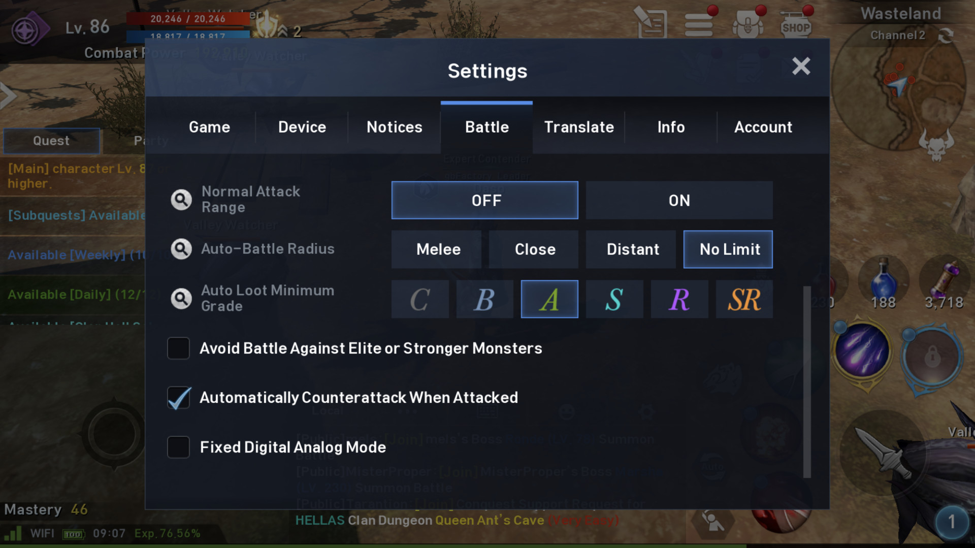
My favorite design element in L2:Revolution is auto hunting functionality.


Grind and MMORPG are two words often used together. There are multiple reasons why designers use grind mechanic. Most common are, leveling playing field for players and natural progression system (the more you play the further you advance). 

But there are also negative sides to that mechanic. Its addictive and people uncommon to MMORPG are hesitant to try those games because of this aspect that is seen as hardcore and time consuming. 

Older generation of MMORPG games often had very steep progression curve. Players had to spend even 4 years to achieve high level. Newer generation of MMORPG’s improved this part by making grind much lighter without the risk of losing experience or player items. But Lineage went even further. 


Developers made whole mechanic semi-automatic, the only moment when you need to pay attention is when taking new quests and receiving rewards. Penalty for dead is tiny and players quickly learn that it’s ok to not focus 100% of the time. Lineage developers cleverly combined idle games mechanic with MMORPG grind and created something light and surprisingly approachable. This part significantly improves UX for players by allowing them to have semi idle play instead of being fully occupied by the game.

Creating “shop habit”

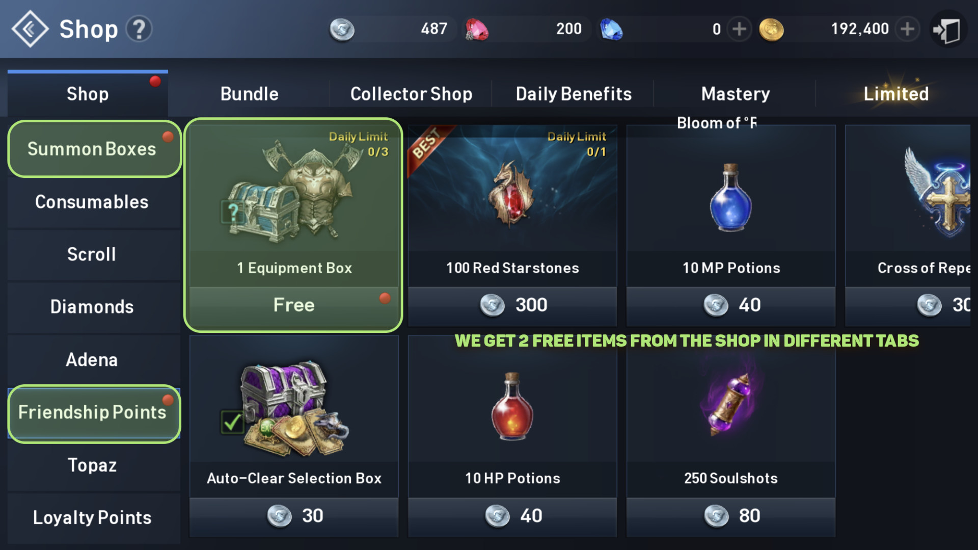
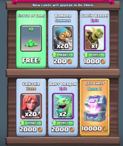
Interesting practice used by more and more developers is to offer free items or various benefits inside the shop menu. It’s a mechanic that tries to improve conversion rate by showing players that “hey this shop is not that bad go there every now and then”.

It creates habit based on positive reinforcement. It’s less effective in short term (it takes more time to create a habit) but it works better in the long term (players don’t reject that at some point, as it happens when using negative reinforcement). 

Visiting shop teaches players that they shouldn’t be afraid of it, which increases the chance of conversion. Using positive reinforcement is often better because it doesn’t create negative feelings in players.

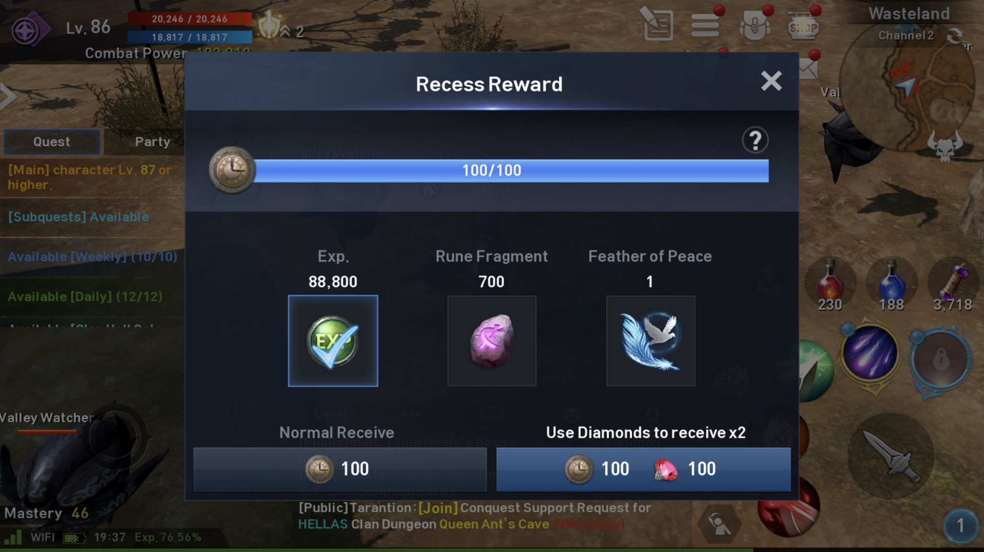
“Away from keyboard” bonus

Another clever use of positive reinforcement is giving rewards for not being online. “Recess Reward” mechanic adds bonus points for every minute that player is offline, until that limit is reached. Then player can come back to the game and pick one from three bonus rewards. It’s a recurring feature, so we can receive that every day.

It’s nice mechanic that again uses positive reinforcement to create habit of going offline. Taking breaks from our game has benefits for both sides. From UX point of view it’s part of emphatic design and it helps to slow down progression and mitigate player burnout.

The same way sport professionals can be burnout, the same way our players can experience that. It can have negative effects on person’s mental health and player retention so we should take that responsibility and remember that.

Progression curve

Game progression in L2:Revolution heavily depends on the player efficiency. Without spending money and playing efficiently we are able to reach level 100 in one month. Current max level cap is 180 on EU servers. Whole loop can be seen as game of resources. 

What I like in Lineage progression curve is that is light enough for players to enjoy leveling up every day. By doing that, players can unlock new features in the game. That keeps players engaged and happy because they see progress, and they feel empowered. It’s a nice system that rewards commitment and doesn’t punish you as much as common exponential progression curve.

This progression loop by itself provides nice experience to players. Bit it has also negative sides as we will see in the next part. 

Core loop to hell

Lineage 2: Revolution has also a dark side. It’s the core loop of the game. 

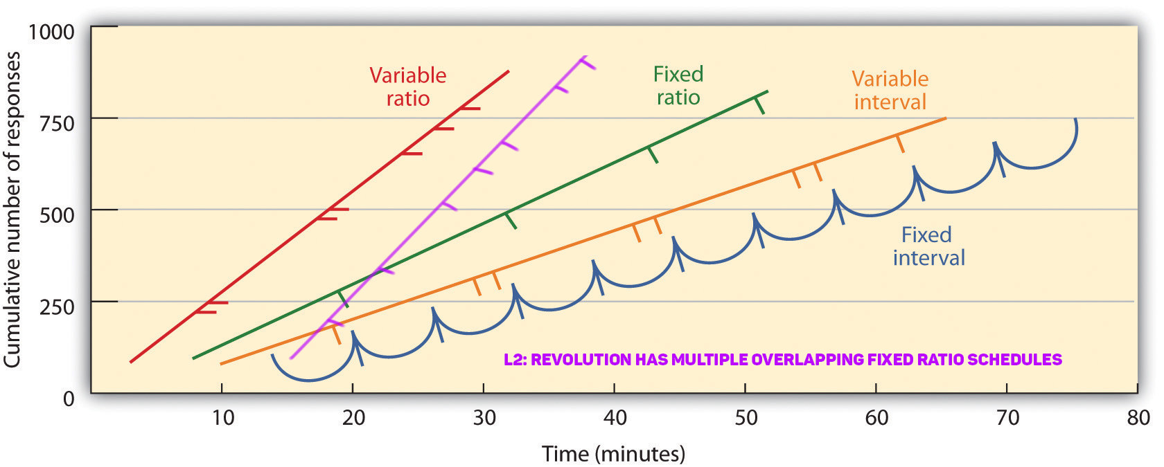
Session length to clear all available activities takes 1+ hour per day. For each activity we get reward and for completing multiple of those activities we can get additional reward. It’s very intensive loop and it’s a form of a skinner box. 

Worst side of this mechanic is that it holds players strong and makes them play with high intensity for long period of time only to leave them exhausted at the end.

Intense gameplay is the effect of using fixed ratio schedule for rewards. It’s a way of giving rewards every equal amount of actions. Key characteristic of this approach is increased intensity of actions when nearing reward point. Now in L2:Revolution we have multiple parallel quests running at the same time. So intensity sometimes does not go down for longer period of time only because we are all the time nearing some reward.


This type of loop reinforced by some of the mechanics that I talked earlier create very addictive gameplay. Because the intensity is so high, people quickly start to feel burnout. Exploiting people for our own purposes doesn’t benefit our audience and their experience.


Cooperation and social experience

One element that Lineage developers haven’t explored enough is cooperation. 

MMORPG is all about having social interactions between players. Being part of a clan, fighting wars, getting to know people and bonding by doing adventures. 

In L2:Revolution playing with others is cumbersome for many reasons. Most quests are for single player and if you want to do them together with friend you need to start and finish every one of them together. If not, you will end up in different regions killing different monsters and not being able to share experience or support each other.

In-game activities are mostly tailored for single player gameplay with few focused on teamwork. Social interactions are key element to good retention, people naturally want to form groups and by not allowing them to do that we are hurting only ourselves. 

Monetization

Monetization is a hot topic among players because it’s synonymous for them with developers that use tricks to bait them into spending money. Monetization itself is a vital element of F2P games because it’s the only way that developers can earn money. Unfortunately L2:revolution doesn’t do much better to improve the general image of F2P games.

Aggressive monetization

Monetizing players by creating aggressive mechanics in the game is approach that many companies embrace consciously or unconsciously. But it has many negative implications that are hard to measure, like long term retention or loyalty. Let’s analyze one example.


Statistically around 5% of players will monetize and 95% of them will never use in-app purchase. To reach that percentage developers tend to use few common techniques to force players to spend money. 

  • We can have gates that can be shortly defined as sudden increase in difficulty (Common in Match3 games)

  • Showing excessive amount of popups with offers and discounts


Those techniques are completely the opposite of what typical UX principles are telling us to do. Those methods usually create negative emotions and we can remove them by spending money (negative reinforcement). With this approach we effectively decrease user experience. In Lineage we can find that kind of mechanics used in multiple places.


Gating often forces player to abandon the game if they are not willing to pay for it. So as we know 95% of user base will never pay, but it doesn’t mean that they are not important to us. 

Paying players that invest time in our game want to enjoy that game with friends. They want to compete with others and show their advantage to other players. What would happen if they would lose that? They stop playing or paying.

Those two user groups are tightly connected with each other. One group won’t exist without the other.

I think it’s clear at this point why aggressive monetization is a shortsighted way of improving monetization for our games. It’s the lack of empathy toward our players that drives that kind of mechanics. So let’s not lose that.
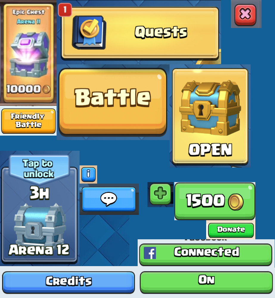
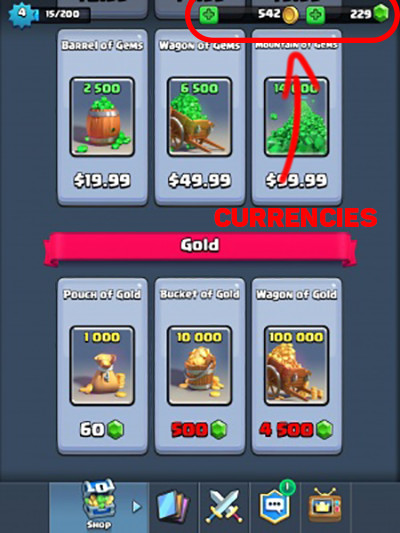

Shop

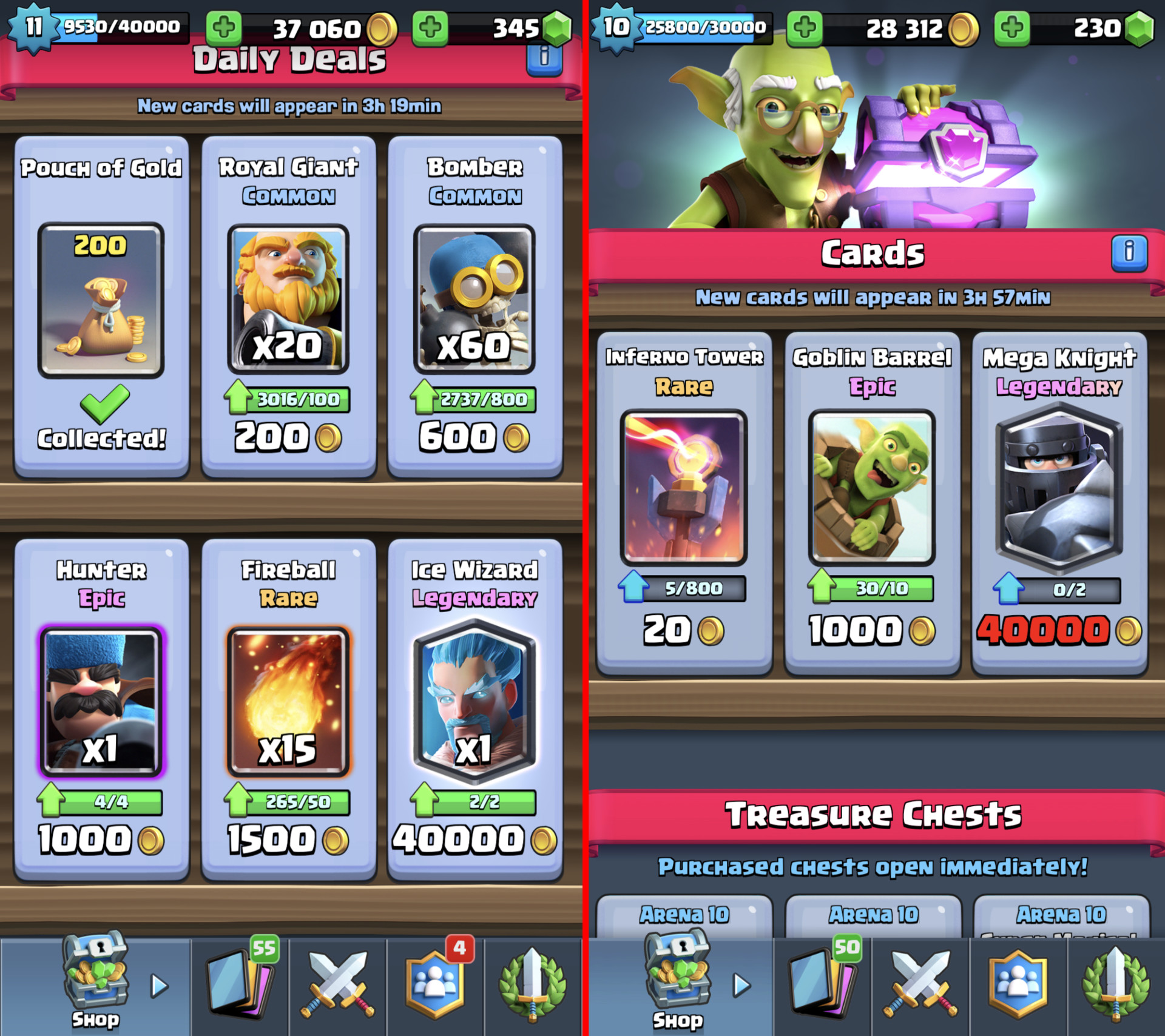
Shop is main way where players get monetized. Lineage 2 shop is overwhelming place for players. It has over 100 items divided into more than 15 categories. Including discount, special offers and free bonus daily items. Having so many options in the shop invoke anxiety because people are unable to compare and pick when faced with too many choices. This cognitive process is called “choice overload”. 

It doesn’t improve user experience or satisfaction from buying because it connects this action to feeling of anxiety and panic.


13 main shop categories, with more hidden inside those categories. You can fit a grocery store in the shop.

Last part of this article is under this link.

Report

UX in Clash Royale - Part 3

General / 24 January 2018

Continuing my article, this one will talk about art and technical things. Link to part1and part2

Technical

I've created this category to show that not only art and design department can improve user experience. Many things in here are common knowledge but paying attention to them and pushing to limits is extremely important. In smaller mobile teams, everyone is a UX designer if you want it or no.

Fast loading times

Self-explanatory title. Usually achieved by having game that loads small amount of data into memory. Clash Royale is a small scope game and developers paid attention to asset optimizations. They use multiple tricks to improve memory consumption. To name few, they have used sprite mirroring or optimized number of frames for character animation. Thanks to that, game itself has really good loading times, on iPhone 7s Plus loading times are around 4.5 seconds. 

Of course, not every game will be able to optimize loading times to that level, it all depends on the goals and type of the project.

Two examples of how textures are packed inside Clash Royale. On the left we have Elixir Collector and on the right Goblin Barrel. You can spot how developers are changing team colors on units, probably by placing circled elements onto the unit/building itself.

Loading screens

As we just discussed, loading times are a common bottleneck. Every second that player sits on the loading screen increases the risk of him switching game or going to a browser. It takes away the pleasure of playing the game. 

There are 2 loading screens in Clash Royale. We have one when entering the game and second one before entering battle. That is really conservative and works really well for UX.

Battery Drain

Another common problem while playing games is battery drain. Pushing the performance out of your device makes it drain battery. Many games have problems that phone is out of battery in 2h. Especially games that have real-time 3D graphics and require internet connection. Supercell's original art style has few advantages in this area. The art style is based on 3D prerendered sprites so it's basically a 2D game.They are lighter on GPU so it allows playing CR for longer period of time. I assume that is only part of why Clash Royale doesn't consume battery so fast but I don't want to speculate too much. It's good to be aware of those things. Players care about that and developers should also.

Disconnecting from game

Clash Royale requires players to be online. Like with every online game there is a possibility that you might lose internet connection, especially while traveling. Clash Royale allows players to rejoin match after they lose connection or close the app. In this case additional advantage is having an app that starts really fast like it is with game from Supercell.

Having ability to reconnect minimizes anxiety for users. It might not be their fault that they lost the connection. So being able to go back to your important tournament match after being disconnected it's just empathetic. 

There is one situation that might show us how Supercell cares about users. Few months after game went live, developers noticed that players are pushing much stronger after opponent gets disconnected with hopes to gain advantage while player is trying to reconnect. So, they introduced a fix that removes notification that your opponent got disconnected. Now if you get disconnected it looks like your enemy is thinking a bit longer what card to play. It's a small change but gives players time to reconnect and makes it fair play.

Left image is the old notification for opponent loosing internet connection. On the right is for player when he lost connection.

Ordered randomness

Often when people talk about randomness they have something specific in mind. Players don't like to hunt for 1% rare drop and after 100 or 200 drops they still can't find the item they are looking for. That is why randomness in games is in reality pseudorandom, it's fully deterministic but appears as statistical randomness.

In Clash Royale chest drop has predefined order to imitate randomness. Everything is about mental model. If the player thinks its random and they like it, that is enough. 

People discovered the order of chest drops in Clash Royale and it's publicly available so everyone can look it up. Adjusting randomness is interesting practice and shows that developers thought about making the game experience good from every point of view.

Screenshot from clashroyalearena.com where we can find full chest drop order. This is only part of the order.

Aesthetic

Aesthetics is one of the main weapons of UX design. With proper aesthetics, user experience can be incredible or awful.

Art Style

Supercell created their own unique style. We could describe it as prerendered 3D Pixar-esque look adapted onto mobile platforms. It works really well on mobile because it has strong contrast, bright colors and distinctive silhouettes. That makes the style readable on the screen of your phone.

Picture above shows how distinctive units are from each other. That includes icon, shape and color.

Gameplay Colors and VFX

Colors are of great value when used to emphasize gameplay elements. Clash Royale developers use colors to improve readability and clarity of information. Examples of that are found: 

  • When time is running out, screen starts to blink with red outline

  • When units get damage, it blinks with brighter color

  • Full elixir bar glows and has animated effect

  • Cards have radial progress until elixir reaches the point when they can be used

  • Each unit has their own characteristic color theme

  • When units have statuses like poison, freeze

  • Blue and Red colors to differentiate between teams

All that improves experience and help players understand gameplay without spending too much time on understanding the situation on the battlefield. Consistency is important factor with visual style, especially when it's part of the gameplay. As we can see art is tightly connected to game design. Interactions and visual style are often combined. It's important to understand this combination because this is the only way that our games can reach next level.

When game goes into overtime player sees reddish frame around the screen to indicate that.

UI Colors

I already mentioned a bit about colors in the UI. Developers used yellow, green and blue for UI elements. Yellow is used with most important functionality, green is of secondary importance and blue is a background color or sometimes used on buttons. 

Properly used colors provide clarity for the UI. They direct player eyes to specific places.

As we can see there is 4 color in the UI which is used for notifications and exit button.

The Bad in Clash Royale

Clash Royale by no means is a game without flaws. But developers successfully minimized those problems to the point that interacting with the game is a pleasure. We need to remember that improving user experience is an ongoing battle. 

Biggest UX problem that we can encounter in the game is input delay.

Input delay

This problem is treated by many players as a bug. Unfortunately it's by design, reason for it is that Clash Royale is an authoritative game. Authoritative means that whole game logic is calculated on the server. Usually input needs to travel from both players to the server where gameplay calculations happen, after that server sends back the data. My assumption is that developers made hard-coded delay of around 500ms to make sure that server receives all data and is able to send it back on time. It might take more time if the connection is slow but most of the time it's a really stable system.

We might want to ask a question, why use system that cripples gameplay experience?

The reason for that approach is to remove most of the loop holes for players to cheat. It's common in online games that we can find users not playing by the rules. Calculating outcome on the server removes most of the problems with cheating. Everything is controlled by one server so the result for both players is always the same. I think most of us had experience with cheaters so we should understand the importance of solving this problem not only from UX standpoint. Developers sacrificed gameplay experience to improve overall user experience, it's a common situation that we as developers encounter on daily basis. Not always everything is black and white. 

Live Game

Games as a service is a fairly new concept in game industry. Supercell focuses on creating games that players can play for years. Supporting live game for long time after launch has many side effects. Players need more features, big features and shiny features. With every new feature our game gets more and more complicated. For UX that is a problem that increases over time.

Even rather new game as Clash Royale has saw decline in UX. It's inevitable but we should prepare for it so we can handle that better over time. Long term planning is one element that can help us with it.

New and old shop.

Updates

October 2017 update to Clash Royale introduced many changes to the game. One of those changes concern shop items. Every few days shop offers players ability to buy Epic Chest for coins. It's unique opportunity and usually it's good idea to buy it. With newest update developers changed visual look of the button that holds that item. Now it's yellow. Why is this a problem? Well, up until now yellow was associated with key functionality and rewards. Rewards are always for free in Clash Royale, no soft or premium currency involved. This change can create confusion, because it breaks consistency, especially because it's related to in-apps.

In the same update developers removed red font color when you lack resources to buy an item. That is another change that breaks consistency. UX suffers from it because it tricks player into tapping on the item thinking that you have enough resources to buy it. If player is not paying attention you might try to buy that item.

Fortunately developers listen to players and they brought it back in the following update.

Item for free is green, and payed item is yellow. This breaks consistency because up until now rewards were yellow.

Summary

We know immediate effects of better UX in games, players feel more immersed, they enjoy interaction and want to come back. But there is also long-term effect on our audience. Fairness and empathy toward our users create special bond between developer and players. If we care about the user they will reward us with loyalty. But if we do the opposite, players will react accordingly. I think now we can easily see why Clash Royale is a popular game and why other developers should follow their path.

Report

UX in Clash Royale - Part 2

General / 23 January 2018

Continuing my previous blog post that you can find under this link and third part here

I'd like to start with talk about empathy.

Emphatic Design

I'm a strong supporter of user-centered design in games. In the end, we are making products for people to enjoy. In Clash Royale, we can find many examples of this approach.

There are many benefits of emphatic design. When you take care of your users they respond with loyalty. That leads to better retention and this leads to higher conversion rate into paying users. 

Emphatic design has also long term effect on players. The chance of player coming back, after leaving our game with negative emotions is low. In contrast, player leaving with positive emotions often comes back to check on new updates. When developer is releasing new game it's much easier to convince players to try it, because of those positive memories.

User Acquisition cost for mobile games grows every year. So when we acquire that player to our game, we should put his well-being as our top priority.

I will mention few things that we already covered and they are important for user-centered design.

  • Properly implemented notifications. Players know what they want to do in the game, don’t force them to spend their precious time on other things.

  • Minimalistic shop with a clear description of items. Most people don’t spend money (~5% users pay). But the ones that do, want that experience to be good. So, don’t force players to hate that experience because they won’t go to the shop anymore.

  • Portrait mode greatly helps with one hand interface. Mobile games are all about experiencing game while you are mobile. Many players don’t want to sit and spent 100% of their focus on a game.

Interactions

People often have different habits when interacting with UI. Changing user habits is really difficult. Best-case scenario is creating UI that can be used in few different ways, and reach as many users as possible. Obviously, it takes more time and analysis. Clash Royale developers thought about it and gave players the ability to use parts of the interface in few different ways. 

Gameplay is a key part of the game and in this place, we have that ability. In Clash Royale, gameplay is all about dropping cards on the battlefield, so developers gave us 2 ways to do it.

  • Drag&Drop – You drag card from the bottom part of the UI to destination.

  • Tap&Tap – You can tap on the card to select and tap to place it on the battleground.

Main menu of the game has also many improvements in this area. We can donate cards to other players in two different ways:

  • Tap "Donate Button"

  • Tap or Hold (To donate multiple cards) card image on the donation request

Menu navigation:

  • Swipe left and right to change view

  • Tap the icon on the bottom to change view

Opening Chests have also two modes. Slow and fast opening, it's a small improvement but after having to open 100+ chests it’s a huge time and anxiety saver.

User Interface

Tooltips

Clash Royale uses tooltips in confusing places, so player can always learn through interaction. Look of info button is always the same, so players quickly learn meaning. It's important with minimalistic UI's to sometimes have those "guides". It’s a fine balance between not enough information and too much of it. Tooltips are a cheat that allows to widen this fine spot.

Economy

Economy in the game is based on two currencies, soft and hard. This is at least a bit less confusing than having 4 currencies like many other games. One currency for everything would be perfect but there are important advantages to using dual currency in free to play scheme. Main advantage that concerns players is that having premium and soft currency allows for better control of in-game economy. If developer fails to control economy everything starts to fall apart. In-game prices are growing rapidly and often players have too many items. On a high level, game economy resembles real-life economy.

Going back to empathic design. It's easy to forget about being empathetic toward our players. Introducing 4+ currencies into our game won't make it easy for players to understand relations between them. Also, having 10 categories in your in-game shop because of the amount of currencies will not help either. 

Overcomplicating this part leads often to decrease in revenue and user experience instead of the opposite.

Gameplay

Gameplay is what games are all about, this is where players spend most of the time. It's vital to focus on user experience in here because it will define your game.

Gameplay interactions

When interaction is well matched with user expectations it doesn’t bother players. Otherwise, it might happen that they will complain about broken game, horrible gameplay and other things that are likely not the core of the problem. Player feedback is valuable but needs to go through person that interprets that feedback. 

Clash Royale developers focused on clear and understandable gameplay by limiting distractions. Because of that, players can focus on the gameplay and game supports them by providing all needed information. Key gameplay interactions that we can find are:

  • Spell range, visible with red or blue based on the team

  • Unit drop available area. Some units are able to drop on the enemy’s side

  • Deployment time varies between units

  • Damage visual effect to indicate that units are giving damage to enemy

  • Visual effect when units get statuses like freeze or poison

Different visual cues.

In here, I want to stress that consistency with interactions is elemental. Players need to create a habit when reading information and doing interactions. When those are consistent player can develop mastery. That improves their immersion in the game and allows them to enter flow state much easier. Clash Royale is a real-time competitive game, so interactions are win or lose condition for players. The importance for this element should be clear. 

Placement importance

Clash Royale gameplay is all about timing, positioning and resolving mini skirmishes around the battlefield. I already mentioned that each unity has unique deployment delay and some units can be deployed on the enemy side. We have also a grid of equal rectangles so when we are placing unit, game algorithm snaps them to that grid. Placement is important because it affects unit target. Depending on the placement unit can target tower, building or number of enemy units.

By introducing grid, developers improved user experience in a big way. It allowed them to have clear definition of a unit. Character description can specify attack range for example, Archer has range of 5 tiles. It allows players to quickly measure distance in the heat of battle. Without grid and unified measurement, players would have hard time doing that in real time.

Different deployment areas.

Tutorial

Tutorial in games is usually one of the most underfocused part of the game. And yet it's the key element to engage players in first few minutes. You might lose even 10% of your user base by having bad UX in tutorial. 

In Clash Royale, tutorial throws you in first second straight into the arena and tells you to defeat the opponent. It doesn't treat players like idiots. It suggests what to do but doesn't limit your movement. You still have the freedom to do whatever you wish. Tutorial mechanic doesn't break the flow of the game by forcing specific actions. 

It also doesn't end after the battle. It continues the same as if you would play a normal game but with guides. The only moment that tutorial limits your movement is when upgrading card for the first time. This part could be done better, so it doesn't limit user, but the key element in the tutorial is to engage user as soon as possible. This is achieved by throwing player into the arena in first seconds after starting game. The implementation of the tutorial allows players to get immersed. First few games are against AI and they might be tailored but it's hard to tell without knowing the implementation. After 7 wins you can participate in PVP battles. So tutorial allows users to learn the game with AI and then they are thrown into online battles.

Guides in the tutorial.

Player Communication

A common problem in online games is in-game toxicity. Many top titles have that problem like League of Legends, many MMORPGs, and mobile games. By not including global chat and limiting communication in the arena to predefined emotes and texts in the gameplay, Supercell effectively cut most of the toxicity from the game. You can still freely chat in the clan but players can control that by themselves so it doesn't affect toxicity as much.

I am personally in favor of limiting verbal and text interactions in games. Instead, I prefer focus on interactions between players in the gameplay itself. A good example of that approach is Journey made by That Game Company. Forcing people to interpret different signs or emotes we allow players to create their own world of communication and usually, it's more positive.

One of the most common reasons why people play mobile games is to relax. For this group of players emotes in Clash Royale can evoke negative emotions. They are not offensive but players often dislike some of them (laughing emote). But it's hardly toxic. In the CR community, there were many voices to implement permanent mute for in-game interactions. Developers responded that they believe that interaction is part of the experience. If they are right it's hard to judge, I'm personally split in the opinion.

In-game communication.

This is not the end. Next part and last one will be about technical things and art. Stay tuned!

Report

UX in Clash Royale - Part 1

General / 16 January 2018

Welcome to my new series of articles discussing UX in games. If you want to jump straight to my analysis scroll down to chapter called "The Good ". This article is divided into 3 parts, you can find second part in here and third part here.

With this text, I will try to answer a question: Why Clash Royale is so popular and why UX is a big part of it? My personal goal with this series is to get into the habit of analyzing games and explain this analysis in an understandable way for anyone who wants to hear about it. I would like also to spread appreciation for UX in games and art. I think it's a neglected topic in many areas of game development. We artists are possessive of our own kids (art), so we feel threatened by everything that tries to influence us directly. I’m sure other disciplines feel similar, that is why UX experts have a hard time convincing people to listen to them.

I encourage readers to comment and let me know how I can improve my future articles. Ideally, I would like to see a discussion about this important topic. UX is crucial because it saves time for users, a small change can lead to hours of time saved for your audience.

Why UX? Because I care about players and I want them to enjoy products that I make.

UX gains special meaning on mobile platforms due to the types of devices and games developed for them. Common things in mobile game market are casual games, short play sessions, and social interactions. UI is often really simple, gameplay readable and you need to be able to play it outside in the real world.

I see user experience as a design philosophy that focuses on combining science and empathy toward end users. Part of that is generosity, but it doesn't mean making the game easy. It means understanding your audience and creating the game tailored to it. That is why I want to start this series with a game that cares about players in an interesting way.

Clash Royale

Clash Royale was released in March 2016 by Supercell, one of the most successful companies on mobile market. It earned already more than billion dollars. It's a competitive arena card battler. The game is a very interesting case of a game with a small scope, great UX, deep gameplay and high-quality graphics. I’m mainly interested in UX part, but since UX is everywhere we will touch all kinds of disciplines.

Clash Royale is not a perfect game, but UX-wise it does pretty good job. It suffers from common live product problems. Live games need to meet player expectations, so developers add new features and content. That makes the game grow and usually UX suffers from it. But I would like to start with basics, so let’s start from the beginning.


Clash Royale


The good

Simplicity, Minimalism

Being moderate in game development is really hard, we developers always want to add more features to our games. When crafting UX, being moderate is always a struggle. Minimalism and simplicity are perceived as something worse by many. Yet, it's the key element when it comes to creating fantastic user experience. I'm going to try and defend that statement, so bear with me.

One hand interface

One hand interface might not be a "must have" feature for every game, but it definitely improves user experience. It allows your players to play the game in more situations and places. And that can help you improve retention in your game. 

Imagine a player that play games traveling home, in a bus, standing holding handhold.

Nowadays, phones are part of the social element, so lowering "requirements" is key to make this experience better. Developers of Clash Royale made sure that all key elements of the interface are within reach of your finger, while using phone with one hand. I need to point out that I don't take into account "Reachability" feature on iOS that allows to reach top of the screen without using second hand. For the sake of the article, we can ignore it since it's not part of the game.


I highlighted with red outline key functionalities in the game, all of them are positioned within lower 50% of the screen.

All main functionalities are available when using one hand

  1. Menu bar is on the bottom
  2. Card donation feature is on the bottom
  3. In the battle, card deck is on the bottom. Dragging/Tapping is initiated from the bottom of the screen
  4. Chest area is on the bottom
  5. Popups are never full screen and tapping on the background closes them


Highlighted area closes the window.

UI depth

There is something interesting with CR interface. The deepness of the UI almost never goes more than one level, and in some special cases when it does it is cleverly hidden to look like one level. On top of that most of the popups are not fullscreen. Why are those things important? Few reasons:

People get easily confused when going through multiple windows, they forgot how to get back, they lose track and interface can overwhelm them. This is frustrating and that hurts their experience.

There is something called Mental Model which is a representation of the surrounding world and their relation in user’s brain. It’s important to create an interface that user expects and knows how to interact with. Showing a popup and not fullscreen window helps the user to orient himself. He can see previous UI behind popup window. It’s a detail, but with UX details are everything.


All types of window in Clash Royale UI.

One menu to rule them all

In the main menu, bottom of the screen is occupied by shortcuts that allows navigation between different screens. Having menu always visible in the UI is really convenient for navigation. Users won't have problems with orientation and they would feel that they are in control of the interface. They can always come back to the place they need to. Division of the shortcuts is intuitive because it’s based on different categories of needs that players might have.

  • Social, everything about communicating and interacting with other players
  • Battle, functionality connected to core gameplay
  • Shop, items and currencies available to buy
  • Cards, deckbuilder with all cards and upgrades
  • Events, tournaments and special events


Main screen.

Cognitive Load

This part focuses on the limitations of the brain. Humans can process limited amount of information at once. After certain point they start to get overwhelmed and confused. UI needs to be designed with that in mind.

In-game shop

When analyzing the in-game shop we can see that it's very minimalistic. Usually, we have up to 6 items on the screen and no more.

There is something called The Paradox of Choice, in short, having too many options to choose from creates anxiety. Our short-term memory can hold up to 7 items -+ 2 depending on the person. Forcing people to memorize big amount of information or making them do calculations in memory can create a really bad experience for our customers.

Putting all that information together shows us why it's so important to be conservative with the amount of information we show to players. Clash Royale shop is a really good example of that:

  • The shop has small number of items to choose from
  • Clear distinction between items
  • Special offers are clearly highlighted. 
  • Discounts are explained with one line of text

Some might say that making shopping experience great doesn't create a better player experience. That in the end, they might spend more money that they don't want to spend. I believe that players should be treated with respect and they should have the freedom of choice. That’s why giving all information needed to reach a decision without creating anxiety makes it best environment for them to decide for themselves.

I'm personally a fan of previous in-game shop version that was in Clash Royale. It was simpler with less information on the screen. I also understand the reasons to change, which are tightly connected to game economy itself. However, the shop is still one of simplest ones that you can find in the mobile game market.


Old shop, new shop and special offer.

Modesty with notifications

I'm really passionate and emotional about this one. Every game that has more than one popup at the beginning of the session should burn in hell. Game session length on mobile platforms is about 2-5 minutes. Forcing player to go through multiple popups (even 2) after opening the game is waste of players time. Usually, players won't focus on the information delivered to them because they enter the game with a specific goal. Much better option is to limit those popups to a maximum of one or having notification bubble somewhere in the UI. Clash Royale uses both options with great respect for players and I think unconsciously, players are thankful.


The only notification screen that you can find at the start of the game.

Key UI elements need special treatment

It's already really common in games to use unique and bright colors for important UI elements. It's no different in this case. Clash Royale uses yellow color (which is first and last color that people see in their life) for buttons like Enter Battle, Request Cards, Use Card and Invite Friend. Usually those elements beside yellow color, they have special visual effect like animated highlight.

Secondary color that highlights other less important functionalities is green. It's used for functions like Donate, Buy and Upgrade Card.

The red color is used as notification color. Dominant color of the UI is blue and it's used in the background and other less important elements.


As an example, I took main screen of the game and blurred it a bit to show what elements are clearly visible for the players.

This is all for now, stay tuned for second part where I will talk about empathy design, gameplay and more...

Report