
Continuing my article, this one will talk about art and technical things. Link to part1and part2
Technical
I've created this category to show that not only art and design department can improve user experience. Many things in here are common knowledge but paying attention to them and pushing to limits is extremely important. In smaller mobile teams, everyone is a UX designer if you want it or no.
Fast loading times
Self-explanatory title. Usually achieved by having game that loads small amount of data into memory. Clash Royale is a small scope game and developers paid attention to asset optimizations. They use multiple tricks to improve memory consumption. To name few, they have used sprite mirroring or optimized number of frames for character animation. Thanks to that, game itself has really good loading times, on iPhone 7s Plus loading times are around 4.5 seconds.
Of course, not every game will be able to optimize loading times to that level, it all depends on the goals and type of the project.
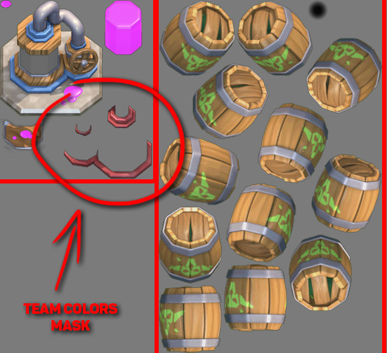
Two examples of how textures are packed inside Clash Royale. On the left we have Elixir Collector and on the right Goblin Barrel. You can spot how developers are changing team colors on units, probably by placing circled elements onto the unit/building itself.
Loading screens
As we just discussed, loading times are a common bottleneck. Every second that player sits on the loading screen increases the risk of him switching game or going to a browser. It takes away the pleasure of playing the game.
There are 2 loading screens in Clash Royale. We have one when entering the game and second one before entering battle. That is really conservative and works really well for UX.
Battery Drain
Another common problem while playing games is battery drain. Pushing the performance out of your device makes it drain battery. Many games have problems that phone is out of battery in 2h. Especially games that have real-time 3D graphics and require internet connection. Supercell's original art style has few advantages in this area. The art style is based on 3D prerendered sprites so it's basically a 2D game.They are lighter on GPU so it allows playing CR for longer period of time. I assume that is only part of why Clash Royale doesn't consume battery so fast but I don't want to speculate too much. It's good to be aware of those things. Players care about that and developers should also.
Disconnecting from game
Clash Royale requires players to be online. Like with every online game there is a possibility that you might lose internet connection, especially while traveling. Clash Royale allows players to rejoin match after they lose connection or close the app. In this case additional advantage is having an app that starts really fast like it is with game from Supercell.
Having ability to reconnect minimizes anxiety for users. It might not be their fault that they lost the connection. So being able to go back to your important tournament match after being disconnected it's just empathetic.
There is one situation that might show us how Supercell cares about users. Few months after game went live, developers noticed that players are pushing much stronger after opponent gets disconnected with hopes to gain advantage while player is trying to reconnect. So, they introduced a fix that removes notification that your opponent got disconnected. Now if you get disconnected it looks like your enemy is thinking a bit longer what card to play. It's a small change but gives players time to reconnect and makes it fair play.
Left image is the old notification for opponent loosing internet connection. On the right is for player when he lost connection.
Ordered randomness
Often when people talk about randomness they have something specific in mind. Players don't like to hunt for 1% rare drop and after 100 or 200 drops they still can't find the item they are looking for. That is why randomness in games is in reality pseudorandom, it's fully deterministic but appears as statistical randomness.
In Clash Royale chest drop has predefined order to imitate randomness. Everything is about mental model. If the player thinks its random and they like it, that is enough.
People discovered the order of chest drops in Clash Royale and it's publicly available so everyone can look it up. Adjusting randomness is interesting practice and shows that developers thought about making the game experience good from every point of view.

Screenshot from clashroyalearena.com where we can find full chest drop order. This is only part of the order.
Aesthetic
Aesthetics is one of the main weapons of UX design. With proper aesthetics, user experience can be incredible or awful.
Art Style
Supercell created their own unique style. We could describe it as prerendered 3D Pixar-esque look adapted onto mobile platforms. It works really well on mobile because it has strong contrast, bright colors and distinctive silhouettes. That makes the style readable on the screen of your phone.
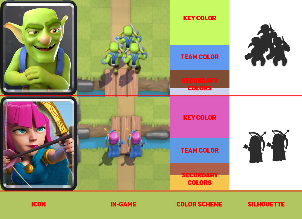
Picture above shows how distinctive units are from each other. That includes icon, shape and color.
Gameplay Colors and VFX
Colors are of great value when used to emphasize gameplay elements. Clash Royale developers use colors to improve readability and clarity of information. Examples of that are found:
When time is running out, screen starts to blink with red outline
When units get damage, it blinks with brighter color
Full elixir bar glows and has animated effect
Cards have radial progress until elixir reaches the point when they can be used
Each unit has their own characteristic color theme
When units have statuses like poison, freeze
Blue and Red colors to differentiate between teams
All that improves experience and help players understand gameplay without spending too much time on understanding the situation on the battlefield. Consistency is important factor with visual style, especially when it's part of the gameplay. As we can see art is tightly connected to game design. Interactions and visual style are often combined. It's important to understand this combination because this is the only way that our games can reach next level.
When game goes into overtime player sees reddish frame around the screen to indicate that.
UI Colors
I already mentioned a bit about colors in the UI. Developers used yellow, green and blue for UI elements. Yellow is used with most important functionality, green is of secondary importance and blue is a background color or sometimes used on buttons.
Properly used colors provide clarity for the UI. They direct player eyes to specific places.
As we can see there is 4 color in the UI which is used for notifications and exit button.
The Bad in Clash Royale
Clash Royale by no means is a game without flaws. But developers successfully minimized those problems to the point that interacting with the game is a pleasure. We need to remember that improving user experience is an ongoing battle.
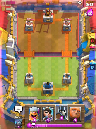
Biggest UX problem that we can encounter in the game is input delay.
Input delay
This problem is treated by many players as a bug. Unfortunately it's by design, reason for it is that Clash Royale is an authoritative game. Authoritative means that whole game logic is calculated on the server. Usually input needs to travel from both players to the server where gameplay calculations happen, after that server sends back the data. My assumption is that developers made hard-coded delay of around 500ms to make sure that server receives all data and is able to send it back on time. It might take more time if the connection is slow but most of the time it's a really stable system.
We might want to ask a question, why use system that cripples gameplay experience?
The reason for that approach is to remove most of the loop holes for players to cheat. It's common in online games that we can find users not playing by the rules. Calculating outcome on the server removes most of the problems with cheating. Everything is controlled by one server so the result for both players is always the same. I think most of us had experience with cheaters so we should understand the importance of solving this problem not only from UX standpoint. Developers sacrificed gameplay experience to improve overall user experience, it's a common situation that we as developers encounter on daily basis. Not always everything is black and white.
Live Game
Games as a service is a fairly new concept in game industry. Supercell focuses on creating games that players can play for years. Supporting live game for long time after launch has many side effects. Players need more features, big features and shiny features. With every new feature our game gets more and more complicated. For UX that is a problem that increases over time.
Even rather new game as Clash Royale has saw decline in UX. It's inevitable but we should prepare for it so we can handle that better over time. Long term planning is one element that can help us with it.
New and old shop.
Updates
October 2017 update to Clash Royale introduced many changes to the game. One of those changes concern shop items. Every few days shop offers players ability to buy Epic Chest for coins. It's unique opportunity and usually it's good idea to buy it. With newest update developers changed visual look of the button that holds that item. Now it's yellow. Why is this a problem? Well, up until now yellow was associated with key functionality and rewards. Rewards are always for free in Clash Royale, no soft or premium currency involved. This change can create confusion, because it breaks consistency, especially because it's related to in-apps.
In the same update developers removed red font color when you lack resources to buy an item. That is another change that breaks consistency. UX suffers from it because it tricks player into tapping on the item thinking that you have enough resources to buy it. If player is not paying attention you might try to buy that item.
Fortunately developers listen to players and they brought it back in the following update.
Item for free is green, and payed item is yellow. This breaks consistency because up until now rewards were yellow.
Summary
We know immediate effects of better UX in games, players feel more immersed, they enjoy interaction and want to come back. But there is also long-term effect on our audience. Fairness and empathy toward our users create special bond between developer and players. If we care about the user they will reward us with loyalty. But if we do the opposite, players will react accordingly. I think now we can easily see why Clash Royale is a popular game and why other developers should follow their path.